

Apple and its obsession with aesthetics are a well-documented part of its history. At WWDC 2025, the company is going to embark on a fresh design chapter inspired by glass elements. Think transparency and reflections, carried over to the app icons, windows, and widgets on your iPhone’s screen. The tablets and desktops, too.
Word on the street is that “glassmorphism” is back. Sebastiaan de With, an ex-Apple designer and the mind behind excellent apps like Kino and Halide, joked that after the WWDC keynote, you can no longer use the word glassmorphism.
Yet, glass is going to be the standout takeaway. Or maybe, we can go with something more elegant, like flowing water. Or the concept of Zen that inspired many at Apple, including co-founder Steve Jobs. “Simplicity is the ultimate sophistication,” Jobs told his biographer, Walter Isaacson.

Apple has already given us a glimpse of its vision for a unified design language, thanks to the namesake OS running on the Vision Pro headset. However, this won’t be the first time we’re going to see glassmorphism on a mainstream device.
What’s glassmorphism, by the way?
In the simplest terms, glassmorphism is a visual design style that’s all about taking inspiration from glass, and specifically, its visual properties such as see-through effects, edge reflections, and depth. When implemented on a digital canvas for apps and windows, we get translucent UI effects and bokeh effects.
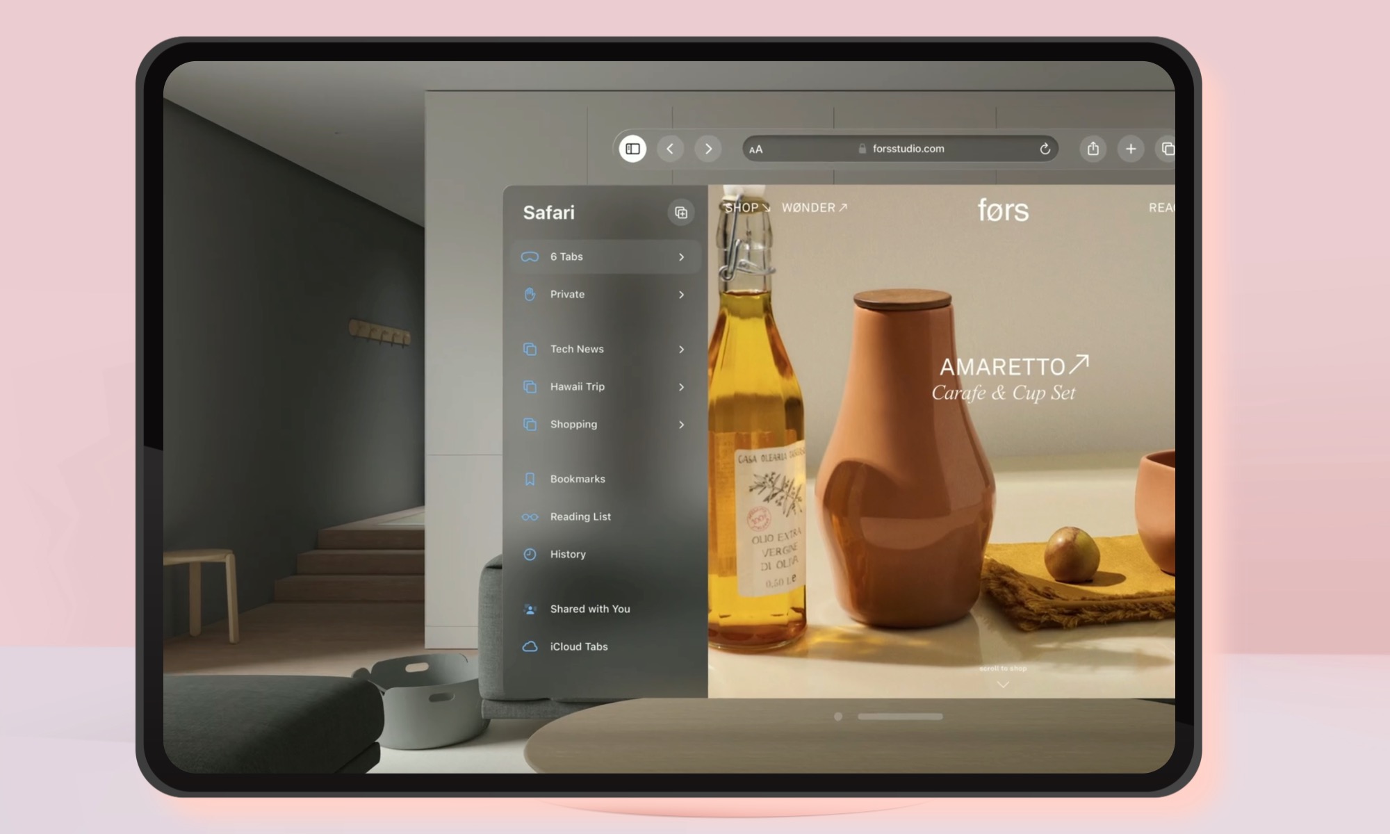
So, how is Apple implementing it across iOS 26, macOS 26, iPadOS 26, and watchOS 26? “The new interface elements are called Liquid Glass, and they have the sheen and see-through visuals of a glassy surface,” reports Bloomberg.
The idea is to go from a flat 2D design to invoking a sense of 3D depth. “Design elements look layered—with objects floating in space—and the top layer seems like a piece of virtual glass,” explains the Interaction Design Foundation.
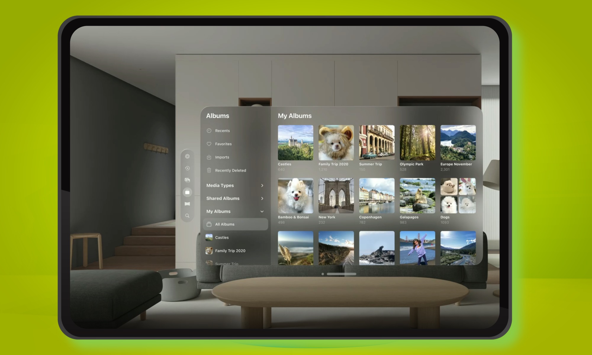
To achieve the glass-inspired design in software, blurred backgrounds are set against vivid colors, and outlines are created in a translucent style. It’s more about mimicking the frosted glass look by putting the foreground against a blurred backdrop, preferably a gradient look with contrasting colors.
The borders are light and have a subtle shadow to produce the depth and visual effects of glass, alongside heavy use of layering. Apple’s design guide also alludes to the glass-inspired design ideology, with full videos giving a detailed walkthrough.

“The default window style consists of an upright plane that uses an unmodifiable background material called glass and includes a close button, window bar, and resize controls that let people close, move, and resize the window,” suggests the company.
Not exactly a new novel concept
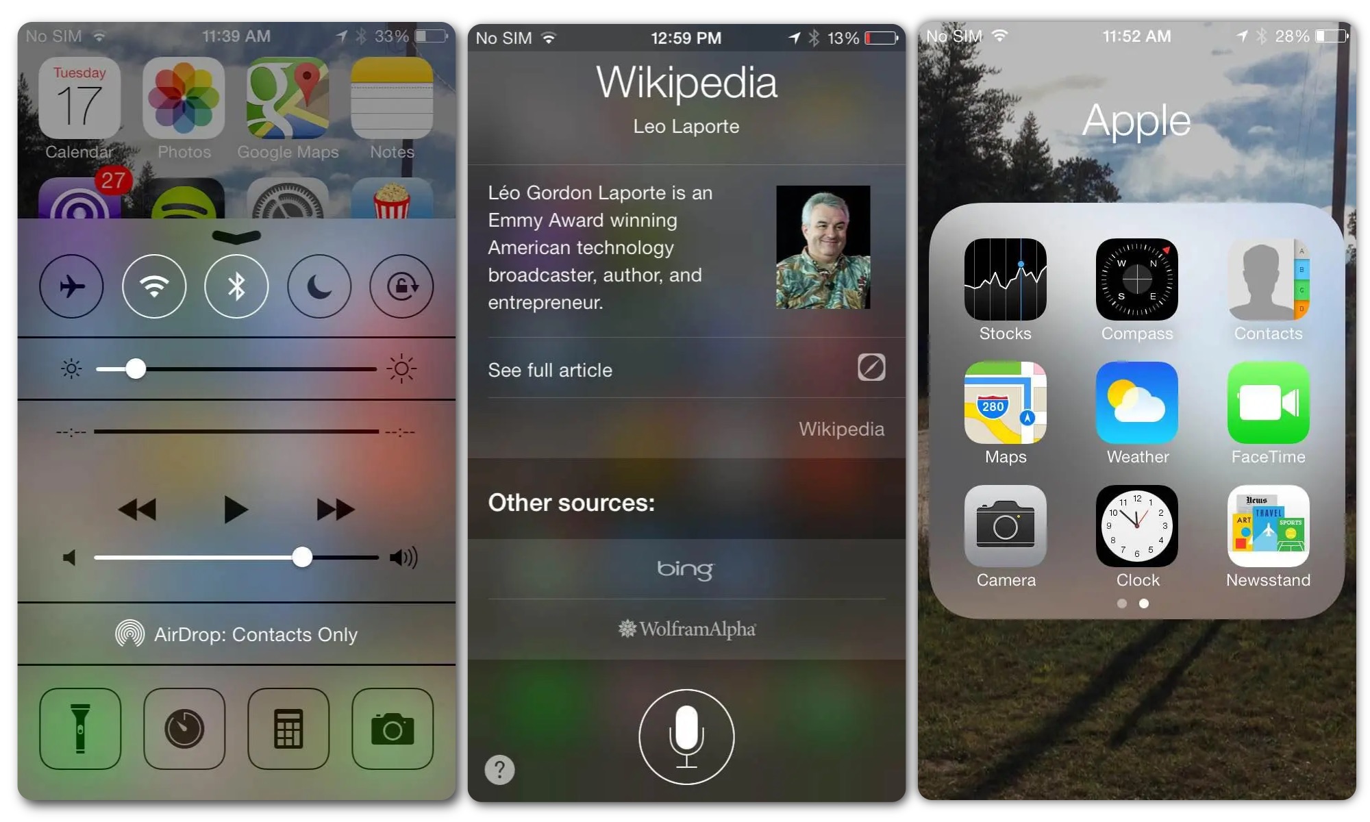
Apple is not alien to the concept of glassmorphism. In fact, the company started implementing elements with macOS Big Sur back in 2020, pushing gradient minimalism with blurred-out background effects for app windows.

Design experts refer to it as frosted glass aesthetics, and it continues to live till date. You can already see elements of this design in the control center of macOS Sequoia. Likewise, opening the app folder on iPadOS will give a glimpse of it.

In fact, Apple first experimented with this design language in iOS 7, and subsequently made a pivot to the flatter design with solid colors that we now see on iPhones and Macs.
Apple won’t be the only player with a taste for glass-inspired UI design. Microsoft introduced its Fluent Design aesthetics in Windows 10, which adopted glassmorphic elements in the start menu and a few other places.
It balanced a semi-transparent background with light shadows and sharp borders to achieve the effects. This wasn’t Microsoft’s first experience with this particular design language. That honor goes to the Aero Glass design in Windows Vista, roughly two decades ago.
The Aero Glass scheme focused on achieving a frosted glass effect, which could appear borderline transparent in certain areas, such as the taskbar and Media Player’s playback control bar. You can read all about it in Microsoft’s archived developer guide here.
Here’s the fun part. Microsoft recently gave us the best look at what a truly glassmorphic design would look like on a computer, without actually putting it on a Windows machine. Sigh. Have a look:
Why now?
We’re not sure exactly how the updated design language of iOS, macOS, watchOS, and tvOS is going to look, except for rumors of a VisionOS-inspired makeover. As per Bloomberg, Apple is hoping to unify the design language across all its products.
“That will include transparency and shine effects in all of Apple’s tool bars, in-app interfaces and controls,” says the outlet. But that’s not the overarching goal. Apple is apparently preparing this design overhaul with the highly anticipated 20th anniversary iPhone in mind.

That device will feature curved glass aesthetics and a seamless screen without any holes for the pill-shaped Face ID and selfie camera kit. It’s going to mark the same kind of product evolution as the iPhone X did years ago.
The iPhone X ditched the thick bezels and the physical Touch ID home button in favor of an all-screen appearance. Apple accordingly made changes to the UI and adjusted the gestures in iOS to help users with the transition. We’ll get to know more about the upcoming iOS 26 overhaul is just a day from now.


